

GoFan at PlayOn Sports
Redesigned GoFan’s web and native experience to unify four platforms, improve accessibility for fans, and deepen engagement through a new design system.
View Live Apps:
To comply with non-disclosure agreements, I have omitted and obfuscated confidential information in this case study. All information in this case study is my own and does not necessarily reflect the views of PlayOn.
Introduction
For over a decade, GoFan has been one of the most popular leaders in high school sports ticketing, allowing family and friends to become fans for every game their resident athlete or performers participated in, never missing a beat pledging their unwavering support.
While the initial product was successful, GoFan’s experience was fragmented and outdated. A lack of an Android app excluded a major user segment, while the iOS app suffered from <1,000 low-rated reviews. Fans faced broken checkout flows, poor performance, and disrupted engagement, while ticket redemption was error-prone—leading to double-purchases, chargebacks, and support overload.
Understanding Our Users: Fans and Super Fans
Our product decisions are grounded in deep empathy for a diverse range of users. Through research, we identified key personas that reflect the real needs and behaviors across our audience:

Jackie
A devoted aunt who lives across the country but makes it a priority to attend her niece’s and nephew’s games in person — often flying or driving for the weekend. She values being there to cheer, celebrate and connect face-to-face.
Goals
Check in quickly and feel like a welcomed part of the school community.
Frustrations
Couldn’t find tickets in account, risk being turned away despite family waiting at the gate.
Touchpoints
Ticket redemption screen on game day, email and SMS, and concessions.

Erika
Much like Paula, she’s deeply involved and supportive—but Spanish is her primary language. Language barriers can make digital platforms feel exclusionary, highlighting the need for inclusive design.
Goals
Support her child fully—buy tickets, attend events and stay informed.
Frustrations
Limited Spanish support in digital tools; feels left out due to language gaps.
Touchpoints
Bilingual website experience, ticketing flow and communication channels.

Laura
Attends every game to support her grandchild. She prefers human assistance over digital tools and feels anxious about new technology—especially when it comes to entry or ticketing. Comfort, clarity & accessibility are key for her.
Goals
Attend every game with ease; sit comfortably and get photos of her grandchild.
Frustrations
Digital-only entry, no cash option and needing help when alone.
Touchpoints
Ticket purchase (assisted or pre-bought), photo gallery access, event entry.

Chris
A tech-native student who wants seamless mobile access to tickets, live streams and instant replays. He values convenience (like Venmo payments) but often faces confusion around digital systems and seating logistics.
Goals
Buy tickets easily via phone (e.g., Venmo), stream games live, rewatch highlights & hang out with friends.
Frustrations
No mobile replay access, unclear payment options and reserved seating confusion.
Touchpoints
Mobile ticketing, live streaming sign-up and concessions ordering.

John
A hometown sports enthusiast with no current student ties. He attends games for connection—to people, tradition and team pride—and seeks real-time stats or streaming options to stay engaged. He’s motivated by social moments and local identity.
Goals
Reconnect with friends, access game stats in real time and stream away games.
Frustrations
Crowded parking, poor streaming quality and lack of a dedicated stats app.
Touchpoints
Game viewing (in-person or online), social media engagement, donations.

Paula
A parent who coordinates everything for her child’s team. She values efficiency, early access to tickets and seating details—and is relied on by other parents for communication. Her main frustrations include slow processes, unclear ticketing steps.
Goals
Buy tickets early for her group; secure great seats, arrive on time & keep everyone informed.
Frustrations
Unclear ticket redemption, long lines at entry and slow processes.
Touchpoints
Ticket purchase (immediate access), event planning coordination, group check-in.
Cross-Functional Team Collaboration
To align 15+ teams—from Product and Legal to Customer Service, Marketing & Schools—my team established a weekly cadence using FigJam for real-time flow mapping and Jira/Confluence to track system dependencies.
Early on, we faced a critical question: How do fans actually use GoFan? Data showed most bought tickets without logging in—so personalization felt like a leap. To ground our vision, we co-created an end-to-end fan journey from event discovery to concession stand visits.
We mapped every action, decision point (e.g., ticket redemption), and system touchpoint—flagging gaps in tech capabilities, team training needs & failure risks before a single pixel was designed. This shared understanding became our north star, aligning stakeholders across platforms and preventing costly rework later.
From Insight to Interactive: Rapid Wireframing at Scale
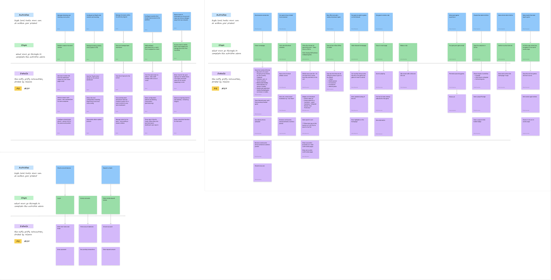
With the weekly cadence in place and end-to-end customer experience flow mapped out, we were able to quickly iterate on user experience, content hierarchy, and overall direction in wireframes.
Rather than designing in isolation, we used mid-fidelity wireframes as a collaboration engine. In shared Figma files—structured by user flow and milestone—we mapped every screen: from discovering games to redeeming tickets with school staff, favoriting teams and viewing fan profiles.
By staying in mid-fi early on, we could test with real content and data without over-investing visually—enabling fast iteration. Every change was tracked in Jira, and stakeholders gave feedback directly via Figma comments or weekly reviews.
Within weeks we had clickable prototypes, allowing us to run user tests with real fans and validate flows before visual design or development began. This approach caught usability issues early—like confusion around ticket access—and saved weeks of rework down the line.
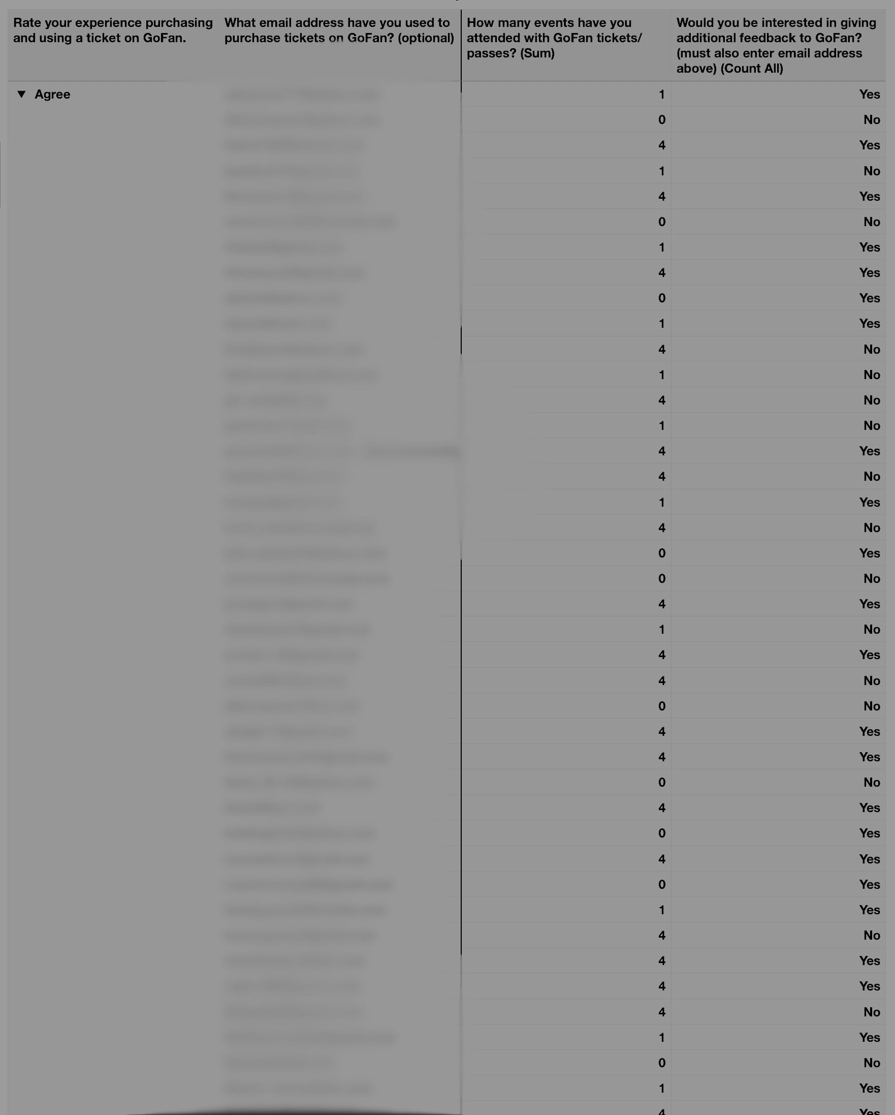
Validating Design Early—With Real Users in the Wild
Integrating the user research and consumer insights stakeholders directly into the core team allowed us to run quick user tests to validate assumptions or find better ways of solving problems.
We embedded user research early by running rapid tests with Figma prototypes—validating flows before visual design began. By involving insights teams from day one, we turned assumptions into evidence fast.
For example: testing check-in flows revealed ticket takers (often volunteers) struggled with small buttons under direct sunlight. We responded by increasing tap targets and contrast—making authorization easier in real-world conditions.
Similarly, onboarding tests showed fans wanted to favorite their team immediately upon opening the app. So we redesigned first-time flows around personalization, giving users instant access to relevant games.
These small tests had big impact: they grounded our design in real behavior, prevented rework—and ensured the product worked not just on screen… but on game day.

Accelerating Insights with a Private, Self-Hosted AI Pipeline
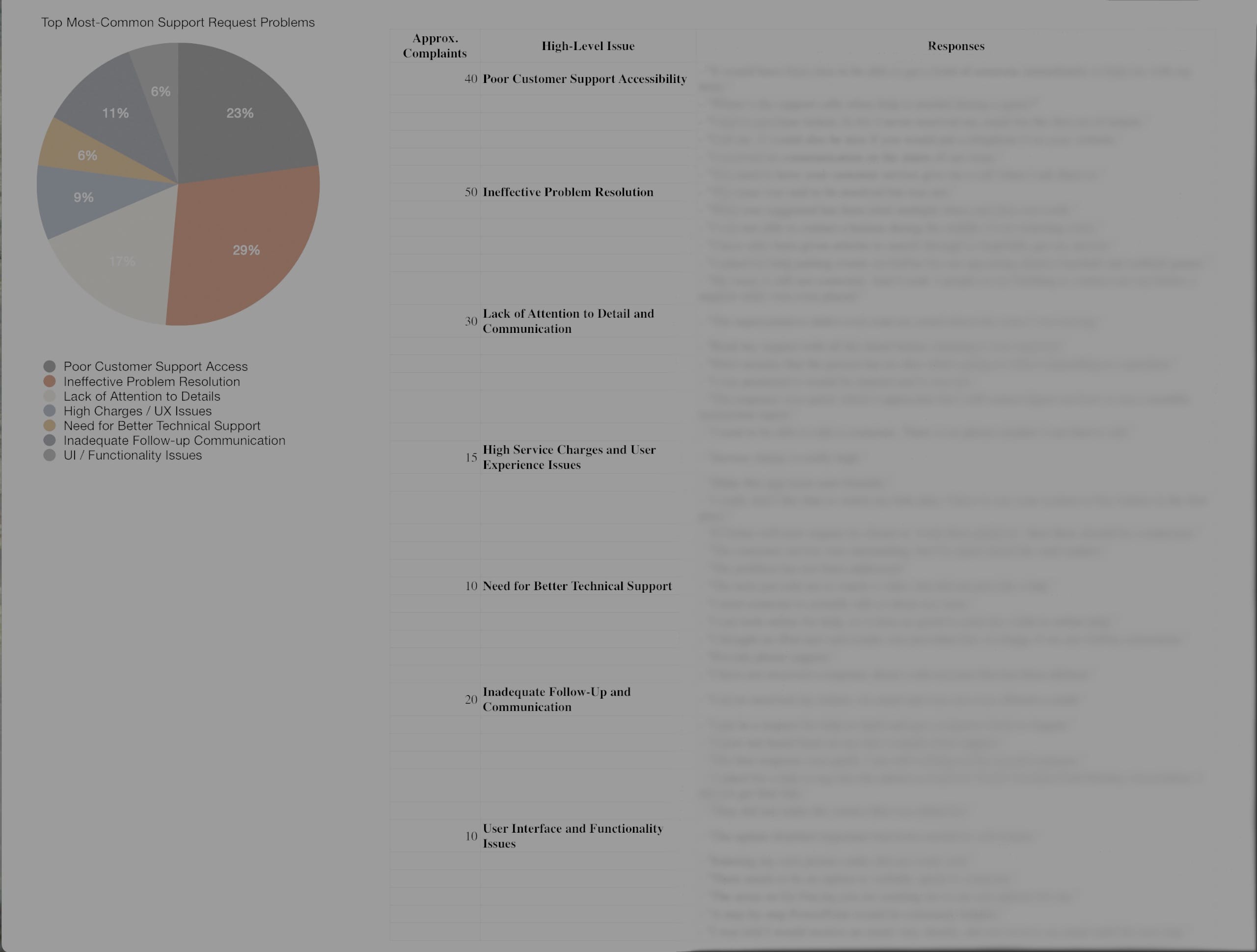
Facing limited access to research tooling, I built a self-hosted, offline AI pipeline on my work machine—enabling rapid synthesis of thousands of customer feedback entries while keeping all data private and secure.
I pulled raw support tickets—positive, negative, neutral—and processed over 5K rows of unstructured feedback in under a minute. Guided by design intent, the pipeline helped me:
- Parse and categorize issues (e.g., “ticket redemption errors”)
- Identify high-frequency pain points with source citations
- Cluster feedback by product area, severity, and sentiment
- Export clean datasets optimized for spreadsheets or visualization
Within hours, I turned 4K+ unstructured responses into actionable insights: prioritized UX fixes, targeted follow-ups with users who shared emails, and executive-ready visuals like pie charts showing top friction points.
No cloud tools. No data risk. Just a laptop, smart prompting, and design-led oversight.
The result? Faster alignment across teams—without compromising privacy or control. This became a repeatable model for lean, ethical AI use in our design workflow.

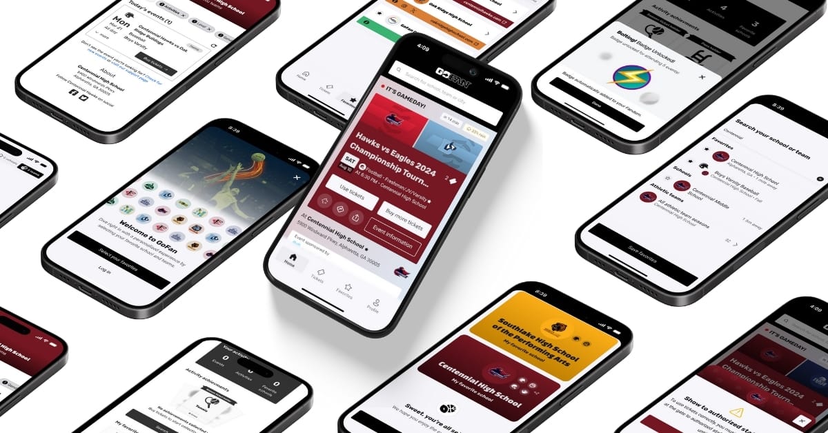
A Visual Language for Game Day
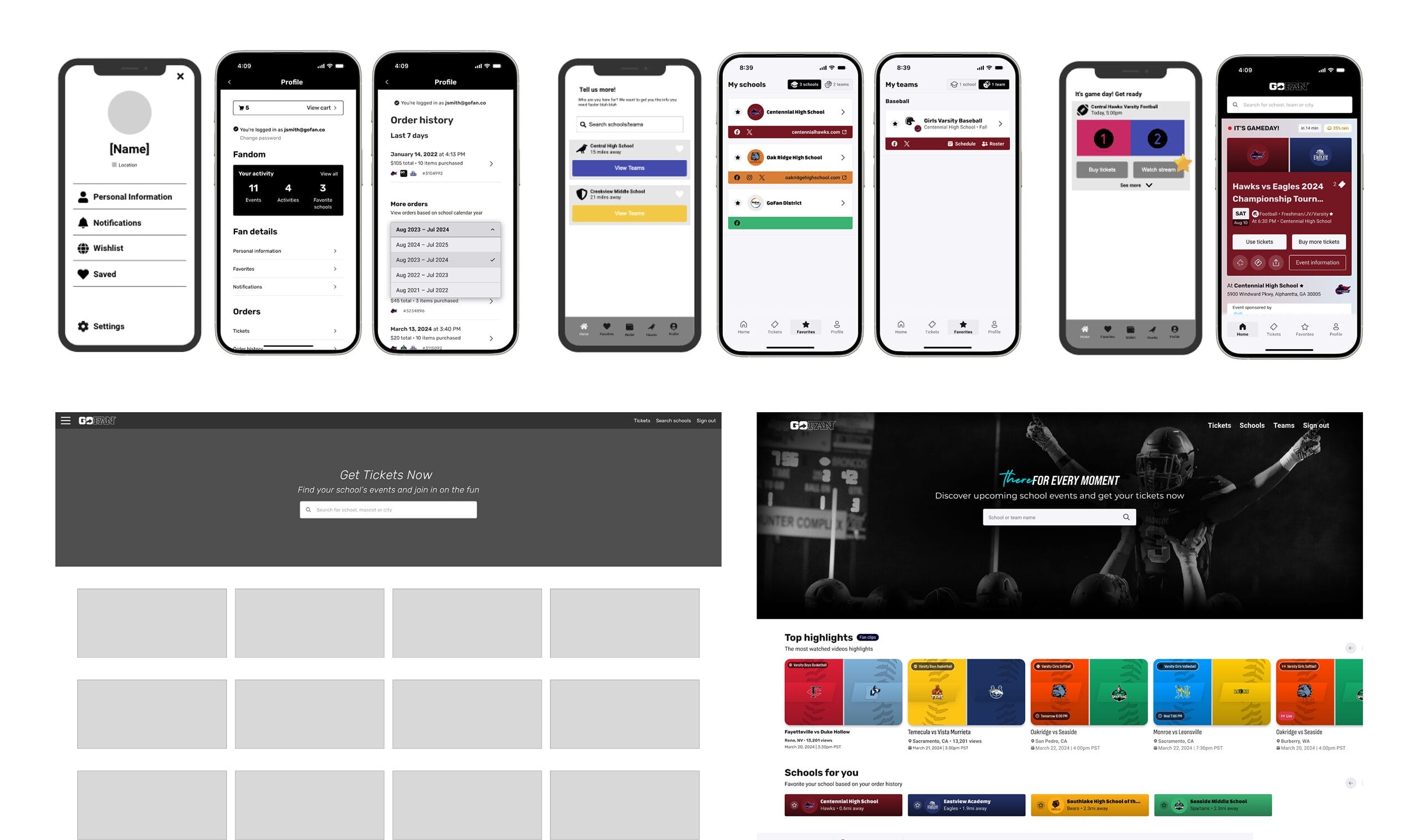
To unify four disparate platforms under one cohesive experience, I led the evolution of GoFan’s design system—balancing brand energy with usability at scale.
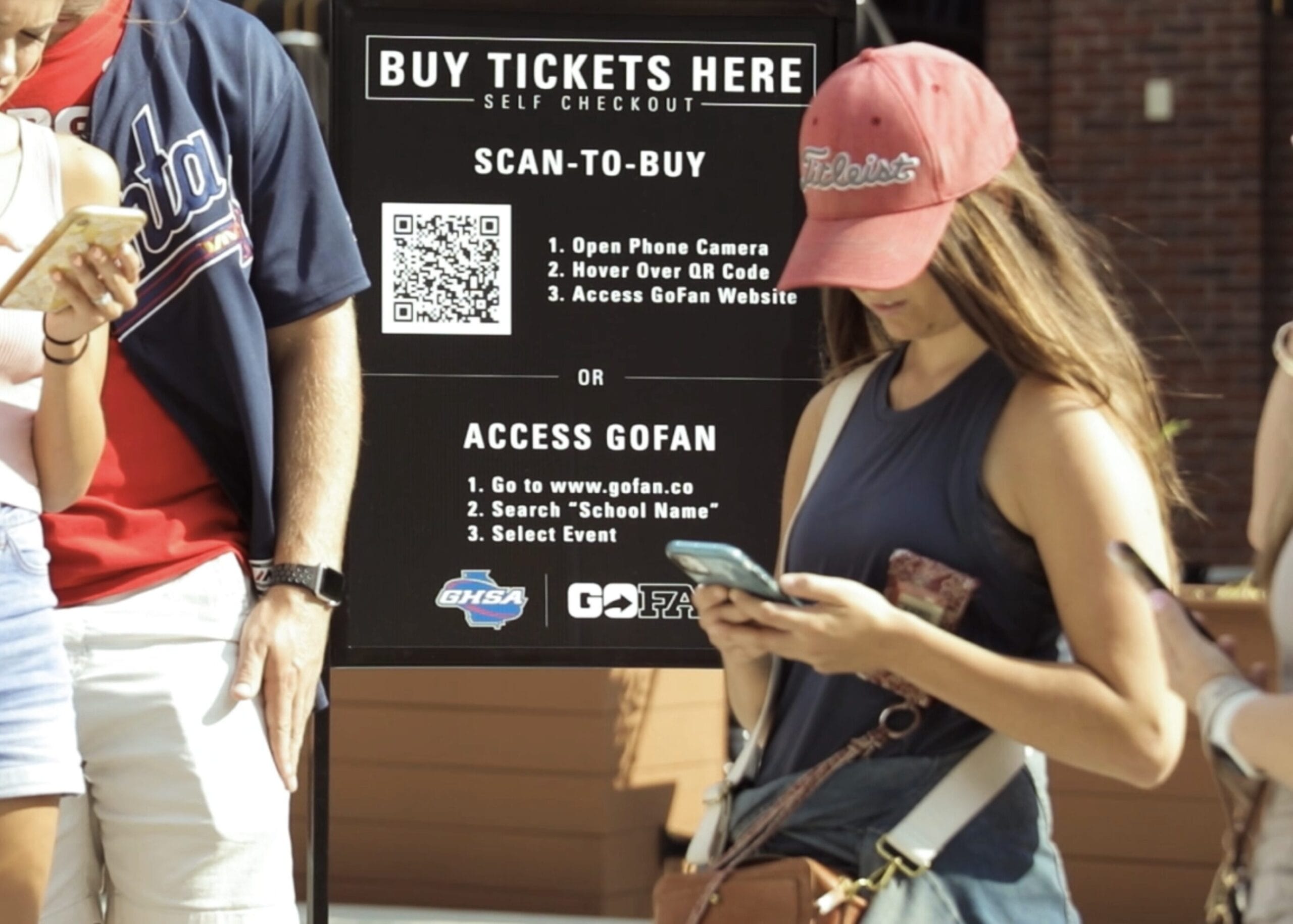
We elevated the existing foundation with bold, gradient-rich visuals; condensed poster-style typography for high-scan contexts (like kiosks or phone screens in sunlight); and a suite of icons, micro-interactions and bottom sheets to create continuity across devices—from handheld apps (iOS/Android) → web portals → 24” self-serve kiosks.
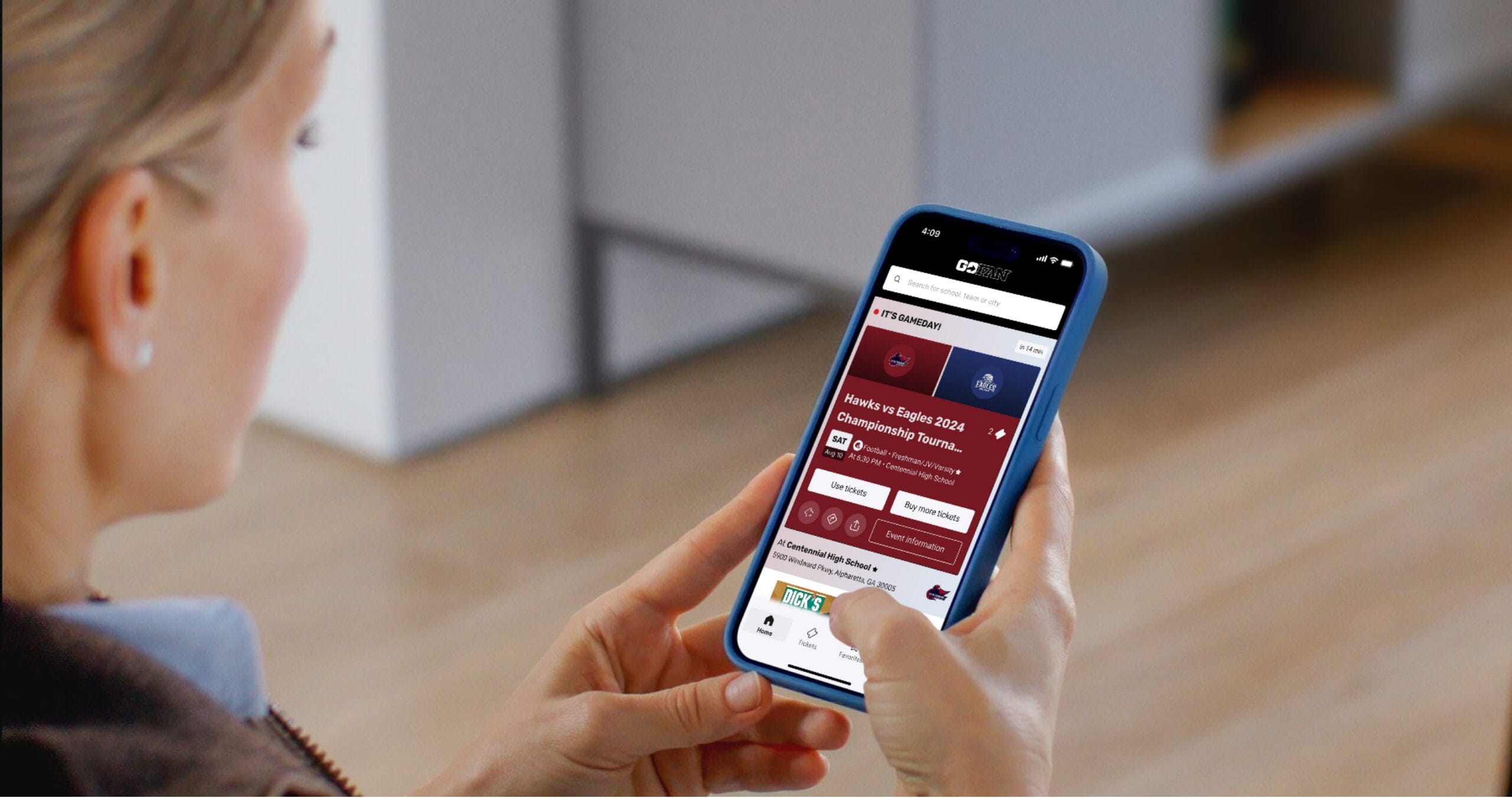
Critical to adoption: we designed for context. Whether fans were receiving a push notification near campus or opening the app cold, their entry point led directly to gameday mode—a personalized dashboard front-loading tickets and event details.
Key moments were infused with intention:
A bottom sheet at redemption reduced tap steps and streamlined access for school staff.
An animated “Enjoy the game!” landing + celebratory gradient takeover on check-in added delight—turning transactional moments into emotional ones.
Copy followed suit: concise, sentence-case language improved readability across touchpoints—from app screens to printed signage.
The result? A flexible, emotionally resonant system that feels familiar whether you’re a parent scanning tickets in the sun or celebrating at checkout on screen.
Nationwide Impact, From Day One
The new GoFan experience launched in phases across 2023—starting with a select number of schools over the summer and scaling to full web + native rollout by the beginning of fall. Within months, over 8 million fans used the platform monthly across nearly 260K events, with seamless purchases, check-ins and gameday experiences nationwide.
Feedback was immediate—and overwhelmingly positive:
- 91% of fans engaged with a new feature they loved.
- 75% of fans said the experience improved their perception of GoFan.
- The app’s rating surged to 4.8 stars (from 3.9) with over 80,000 new reviews in the first three months—and kept rising.
Beyond metrics, something special emerged: connection. First-time volunteer ticket takers could now check in fans by name with confidence, reducing friction and building community at the gate. For many families—their first in-person game since pandemic restrictions lifted—it was more than convenience; it felt like coming back together.
The redesign didn’t just delight users—it earned executive spotlight. The CTO presented the launch at GoFan’s annual Townhall + Kickoff to investors and stakeholders, featuring a teaser reel I led from concept through production—showcasing real fans using the product in action.
With such strong adoption, Phase 2 is already underway: enabling super fan profiles with custom passes, reordering favorites, and deeper school integrations—all within a single, unified app.
Leading The Charge Forward
With such a massive success, the GoFan team immediately began planning for a phase 2 of the project, allowing fans to use their event passes and become super fans with custom embellishments, re-order past orders, and even access their schools’ websites and content without needing to hunt down scattered school links (if it even worked) directly in-app.
We ushered in new revenue models such as ad placements within the experiences collaborating on potential with companies such as Buffalo Wild Wings and ESPN Next, and further unified siloed key data from MaxPreps (deep player history and team stats), NFHS Network (video streaming and stats), and School Sites (school websites and social media). The gap between “online” and “on-site” fans wasn’t just inconvenient—it was exclusionary and we closed in on it.
Conclusion
This project taught me that when design unites systems and human moments—especially in overlooked spaces like high school sports—it can create belonging at scale.
Results
View Live Apps:
For confidentiality reasons I have omitted the actual values for these metrics.